Overview
Signum is a construction business based in the West Midlands who specialise in domestic, commercial and industrial building work. They asked us to design their entire brand including their name, logo, colour palette and typography.
Approach
Creating a brand identity from scratch is a really exciting process and something we love getting involved with. The first important step is to find out more about the business and what it stands for, which we did during our initial consultation with the client and established that the key business characteristics are:
- Bespoke design
- Being industry experts
- Friendliness of staff
- Excellent customer service
- Quality of workmanship
This helped us generate a number of name ideas and the one which we agreed on was ‘Signum’ because of its Latin meaning which is related to signature design.
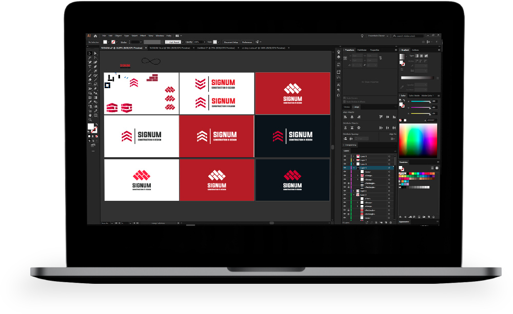
Creating a logo is something which takes time and goes through various stages of design. Good logos tend to be very simple in the way they appear but have symbolic meanings which represents the core values of the business.
Below are some of the logo concepts that we came up with for Signum. We wanted to incorporate building elements into the design to make the logo instantly recognisable as a construction company and as you can see, the first prototype incorporated a brickwork pattern to signify this.
The design that was chosen by the client uses inverted v shapes to represent the roofs of houses and other buildings and is a shape which is very synonymous with the construction industry. In the final version of the logo, three roofs have been stacked on top of each other to represent the three main types of construction work carried out by Signum (domestic, commercial and industrial). We also added different shades on the logo which makes it look like an internal corner of a brick wall and therefore gives it even more depth and substance.
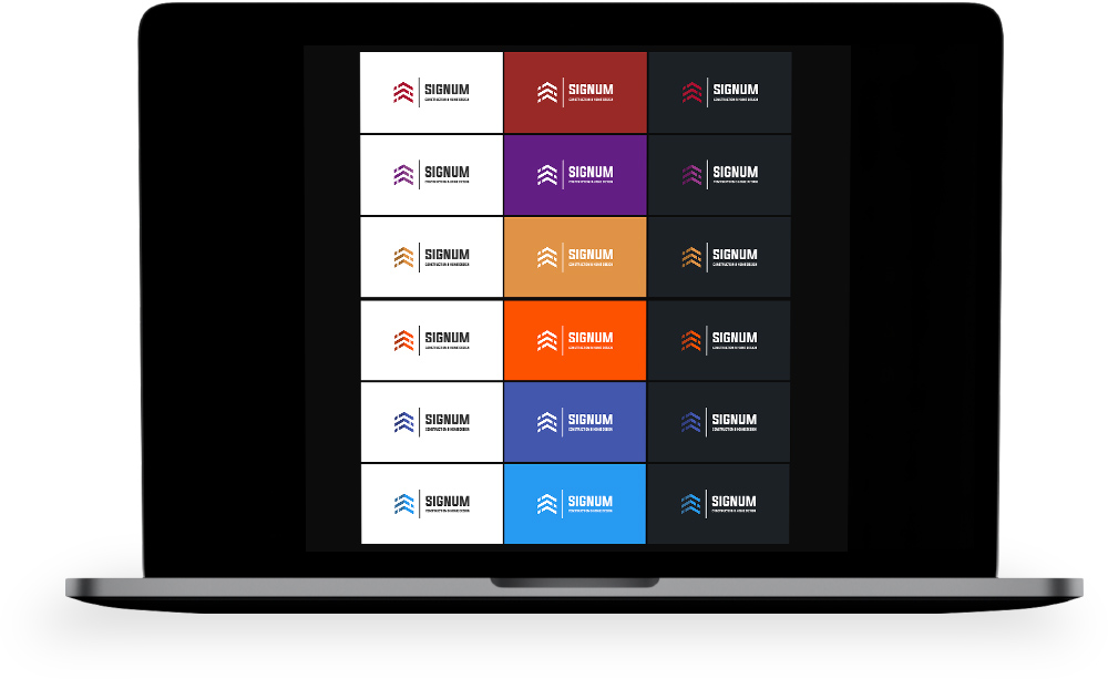
Choosing the right colour scheme for a brand is another important decision and not one to take lightly. It is widely accepted in the marketing industry that different colours have psychological meaning and can invoke varying emotional reactions from people. For example:
- Purple is linked with wisdom, spirituality and luxury.
- Blue evokes trust, calmness and integrity.
- Red shows excitement, youthfulness and energy.
Here you can see some of the different colour combinations that we mocked up for Signum and the orange theme was chosen for two main reasons. Firstly, it is similar to the colour of bricks that are commonly used in the UK and therefore further emphasises the association with the construction industry. And secondly, orange is known to elicit feelings of friendliness, confidence and success which are all key attributes that Signum wants to portray to their customers.
The final element to complete the logo and brand is the typography. Like we discussed earlier with colours, the type of font used also has physiological consequences as follows:
- Serif: Traditional and formal
- Sans-serif: Clean and modern
- Slab-serif: Trendy and bold
- Script: Creative and elegant
The font we chose for Signum is a sans-serif font which means that it does not contain the extending features called “serifs” at the end of strokes. The specific sans-serif font used in this logo is bold and geometric so that it stands out clearly, is easy to read and, perhaps more importantly, it signifies strength and quality of workmanship.
Conclusion
This project is a great example of how we create an entire brand for our customers including the name, logo, typography and colour palette.
The name was chosen because of its association with bespoke design and the logo was developed to be simple, striking and with lots of symbolism which is related to the type of work that Signum does within the construction industry. The three inverted v shapes of the logo represent roofs of buildings and also signify the three types of customer which are domestic, commercial and industrial. Even the colour and font have connections with the construction industry; orange is very similar to the type of colour used for bricks and the geometric lettering shows strength and stability.
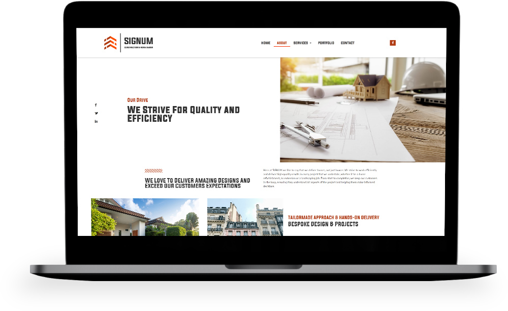
Our client was involved throughout the design process so they could give their input and make decisions. This is very important so that the end product is exactly what they want and so there are no surprises. The customer was very happy with the new brand we created for them and subsequently asked us to build their website.


 Kiklab Birmingham, UK
 Kiklab Bucharest, Romania